
Technical analysis training; Chart Scale and Trading Volume – Part 3
Technical analysis training; Chart Scale and Trading Volume – Part 3: Price charts include the horizontal time axis and the vertical price axis. The price history shown in these charts is raw and unchanged. The scale used in line charts is linear by default.
To better understand the linearity of the graph, the distance between $ 100 and $ 1,000 ($ 900) is shown in the line graph 10 times the distance between $ 10 and $ 100 ($ 90), but this is the case with logarithmic graphs. Graphs are semi-logarithmic because only one of its axes is represented logarithmically but is called logarithmically because of a common error. To better understand this, look at the chart below:

This chart shows the changes between the lowest price ($ 570) and the highest price ($ 19,891) on a linear scale, and due to the large price difference between the two prices, shows the changes in prices below $ 1,000 with a line chart. It is very difficult.
Technical analysis training; Chart Scale and Trading Volume – Part III
But by using logarithmic diagrams and changing the scale of the vertical axis from linear to logarithmic, these changes can be seen more clearly than before. Logarithmic graphs use the percentage change between prices instead of price changes; This means that the gap between the $ 100 and $ 200 prices is the same as the $ 5 to $ 10 price gap, as the price has doubled in both cases. In a standard logarithmic diagram, the numbers 0.1, 1, 10, 100, 1000, 10,000 and… are displayed. It is clear that by giving equal distances between the numbers 1 and 10 and the numbers 1000 and 10,000, smaller changes will also be visible.

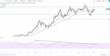
trading volume
The trading volume actually shows the number of digital stocks or currencies traded, which can be added to the chart from the Indicators section or by pressing the / button in TradingView. The larger the trading volume in a timeframe, the longer the bar that indicates the volume. The orange line shown on the figure actually shows the moving average of trading volume over a period of time (usually 20 days). You will learn more about the concept of moving average in the following sections.

Trading volume and price are two parameters on which all technical analysis and trading systems are based. The color of the bars that indicate the trading volume in each timeframe will be red or green, depending on whether the candlestick is closed or ascending.
Technical analysis training; Chart Scale and Trading Volume – Part 3
One of the applications of trading volume is confirmation of breakout and breakdown, which is done in the direction of the desired trend if the high volume of transactions is observed.


Leave a Reply