Technical analysis training; Indicators – Section 8
Indicators are mathematical functions that work based on some mathematical formulas and are used to analyze charts and better understand market conditions.
Price history and trading volume are data used in indicators. Indicators can be used to confirm, evaluate the strength of the trend and predict the trend ahead. Indicators are divided into the following three main categories:
Trends: These indicators are displayed on the price chart and are used to identify trends.
Oscillators: Oscillators are displayed in a separate section below the price chart. One of the main characteristics of this category is to define a range that defines the areas of “over-sold” and “over-bought” (also called purchase saturation or sales saturation).
Volumes: Other categories of indicators that only measure the volume and value of trades. Trading volume is one of these indicators that traders usually use at the bottom of the price chart.
Another set of indicators that only measures the volume and value of trades. Trading volume is one of these indicators that traders usually use at the bottom of the price chart.
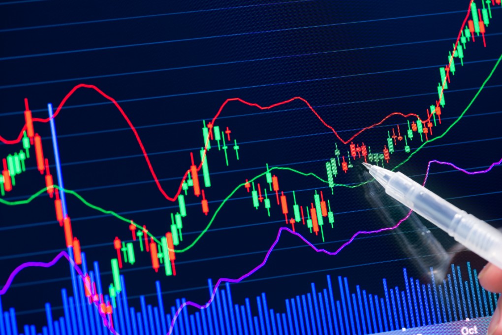
In this part of the technical analysis training, we will examine the important and most useful indicator of the moving average.
Moving Average
Two important categories of moving average index that are widely used in chart analysis are simple moving average (SMA) and exponential moving average (EMA). The main task of the moving average is to smooth out price changes over time, and the use of this index can help us identify resistance and dynamic support lines, buy and sell signals, and trend trends.
The smoother the average price indicates that the price has experienced slight changes over time. Also, by choosing a longer time period, we will see a decrease in the slope of this index and an increase in its validity. The moving average gives us a wider view than the limited view, which considers only the price of the last candlestick.
Moving averages can also be used as a weak indicator of the intrinsic value of an asset over time.
Simple Moving Average (SMA or MA)
This moving average, obtained by summing recent candlesticks and dividing by time period, shows the average price over a period of time.
For example, by selecting the moving average of 20 in the daily timeframe (20-day moving average), the closed price of each daily candelabra in the last 20 days is added together and divided by 20 to produce this index. Some traders use time periods of 5, 10, 20 and 50 for simple moving averages in different timeframes. Some traders also consider Fibonacci numbers (5, 8, 13, 21 and…) as time periods.
The point here is to take into account the indicators of short-term, medium-term and long-term moving averages using different time periods.
Among these, the simple moving average of 50 days and 200 days (long-term moving average) are the most important time periods used in charts.
One of the indicators that determines the rise or fall of financial markets over long periods of time is called the Golden Cross or the Cross of Death. This is due to the passage of simple moving averages of 50 and 200 across different timeframes. When the short-term MA is above the long-term MA, the market is so-called bullish and vice versa.

As you can see in the chart, as the time period increases, the moving average is less affected by the closing prices (orange line) and the moving average with lower time periods follows the price faster than the others (blue line).
The disadvantage of simple moving averages is that outliers make a big impact on the chart. For example, the price of a digital currency decreases strangely in the face of a rumor overnight, and the next day, with the denial of the rumor, the prices return to normal. If you use a simple moving average in this chart, the probability of error increases, so the exponential moving average can give better results to the trader.
Moving Average (EMA)
The advantage of this index over its simple counterpart is that it gives a higher price to recent prices compared to past prices. The moving average or EMA is closer to the recent price and therefore sends more signals for buying and selling, which can also be more likely to be wrong.
Of course, the selected period is also effective, so that by choosing long periods, you will have a wider view of the prices, and the credibility of the trend that this index informs about will also increase.

The selected time periods for the EMA are the same as for the MA, except that the most popular moving average is the 20-day moving average. EMA is usually used for shorter periods to enter trades and MA is used for longer periods to determine the general trend.
Dynamic support and resistance lines
Another application of this indicator is its use as dynamic support and resistance lines. In this way, the price will react differently when dealing with this index, depending on its resistance or support. For example, the EMA-20 or MA-100 and MA-200 are known daily as a strong support and resistance line in the digital currency market.
Of course, we must remember that for each digital currency, there can be different resistance and support in the moving average index at different time periods and different timeframes.
In addition to the moving average, indicators such as the MACD and RSI are also very popular among digital currency traders. But before introducing these two indicators, it is better to get acquainted with an important concept called divergence.
Divergence
Divergence occurs when the price trend is opposite to the oscillator trend and is divided into two types of positive and negative divergence.
Negative divergence (-RD)
This situation occurs when the price sets a new peak but the indicator fails to record a new ceiling and a lower peak is set. This divergence indicates that the buying pressure has been reduced, but the number and power of buyers from sellers in the market is still greater. After observing this situation, risk management should be done because the probability of changing the trend and returning to the downtrend market has increased.
Positive divergence (+ RD)
Positive divergence is formed in the downtrend so that by eating the lower floor, it creates a higher floor indicator. This divergence indicates a reduction in sales pressure, but this reduction in pressure is not enough to make buyers more powerful than sellers.
Negative latent divergence (-HD)
This divergence occurs when the price of the ceiling is lower than the previous peak, but the indicator records a higher peak than the previous peak. This indicates the continuation of the downtrend.
Positive latent divergence (+ HD)
This divergence occurs when the floor price is higher than the previous floor, but the indicator shows more decline and creates the lowest floor. This is a sign that the uptrend is continuing.
Moving Average Convergence Divergence, or Makedi for short, is one of the simplest and most effective momentum indicators available in technical analysis to gain strength and acceleration of direction and direction. This index consists of two MACD lines and a signal line, the formula for calculating each of which is as follows:
- MACD Line: 26-day moving average – 12-day moving average
- Signal line: 9-day moving average of MACD line
- MACD Histogram: Signal Line – MACD Line
The closed price of each candlestick is used for these moving averages. The MACD histogram examines the changes between the sucker line and its exponential moving average, and if positive, the signal line is below the MACD line. Periods 9, 12 and 26 are the numbers commonly used by traders, although the trader can change these numbers according to his style and goals.
MACD Application: This indicator can be used using 3 methods:
The first method is to use the divergence described at the beginning of this section.
Another use of MACD is when the two signal lines and the MACD intersect. When the MACD line crosses the signal line in the upward direction, it announces a buy signal or an uptrend, and when it crosses the signal line in the downward direction, it announces a sell signal or a downtrend.

In the last method, we set the zero level in the base indicator and consider the passage of the MACD line from this level upwards as a buy signal and the passage below this level as a sell signal.

Of course, buying or selling should not be based on just one indicator, and other indicators or tools should be used to reduce error and risk.
Some professional traders go one step further by guessing the possible movements of indicators such as MACD and RSI. Paying attention to price histories and adapting them to the movements of indicators such as MACD can show the superiority of buyers and sellers over each other in the market, which is not dependent on a specific price.
Relative Strength Index (RSI)
The relative strength index or RSI is another widely used indicator that is mostly used to determine potential return points. This oscillator varies between 0 and 100 numbers; From 30 down the area is called oversold (saturation) and 70 above is called oversold (saturation). For example, in over-sold or oversold areas, the market is saturated with sales, and it is possible to see a change in trends as sales pressure decreases.
This indicator can be used to identify the strength of the trend. For example, in an uptrend with higher price ceilings, if the peaks formed in the RSI are also higher than the previous peak, it indicates that the uptrend is strong and will continue.
Another point is the use of support and resistance lines in the indicators. By drawing these lines, the possible reactions of the indicator to them can be monitored, based on which prices are also affected.
The fact of the matter is that many successful traders and digital currency analysts use these three indicators only to analyze themselves, but there are other indicators that look at the price chart from another angle and analyze it from another perspective. In the following, we will introduce and review some of these indicators.
ATR indicator (true average range)
This indicator is used to predict strong price movements and identify market fluctuations. It is calculated by calculating the difference between the high price of each time period (High) and its low price (Low), and the average is usually drawn over a period of 14 days.
The index actually shows strong market fluctuations (both downward and upward) with sharp increases, as well as small fluctuations that occur in smaller candles with a decrease in the ATR index.
Note, however, that ATR does not provide information about the direction of the market and only identifies market fluctuations. After the sharp fluctuations and large candlesticks that form in the market (whether red or green candlesticks) that lead to an increase in ATR, we must wait for the size of smaller candlesticks and candlesticks to decrease, or in other words, the oscillation observed in each candle to decrease Modify ATR and move away from its peak.
The ATR index indicates how much a digital currency or stock fluctuates on average in a day. Traders can use this issue to determine their losses and profit targets.
For example, to make a loss, you can multiply the number shown by the ATR indicator (2 or 3 times) and subtract it from the price and set the loss on the price obtained.
OBV indicator
This index, while simple, provides important information to the trader. This indicator, which is all about the volume of trades, is calculated in such a way that if the candle closes down, its volume is less than the total volume, and if the candle closes, the volume of transactions is added to this index.
This index, which shows the cumulative volume of transactions, is used to determine and confirm the trend. For example, when the price chart shows a downtrend and the OBV also indicates a downtrend (ie, candlesticks that are closed in descending order have more volume than candlesticks that are closed in ascending order), then it is possible to continue the downward trend. .
It is also possible to see divergence in this indicator so that the strength of the trend and the probability of trend reversal can be determined with OBV.
Technical analysis training; Indicators – Section 8


Leave a Reply